>? This is the spoiler text
which will output
<div class="md-spoiler">
    <p class="md-spoiler__line">This is the spoiler text</p>
</div>
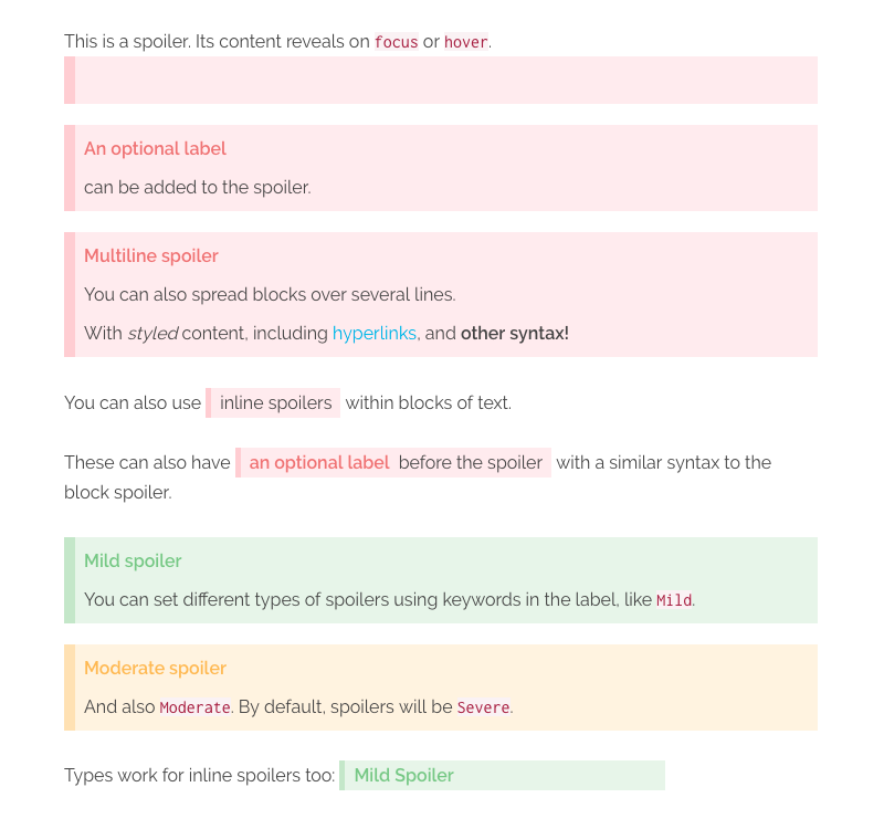
You can also pass in an optional label, wrapped in [], which will be added as an inline attribute and then rendered as a prefix to the spoiler (via the plugin's CSS):
>? [An optional label] This is the spoiler text
<div class="md-spoiler" data-label="An optional label">
    <p class="md-spoiler__line">This is the spoiler text</p>
</div>
The block level spoiler also supports multiple lines within a single spoiler. Labels can only be given to the first line, as it applies to the whole block. However, you can use other inline markdown within the spoiler, such as hyperlinks, italics and bold. Each line will be wrapped in its own p tag, and spoiler lines with empty content will be ignored.
>? [Label here only] This is the _first_ line
>? The next line will be ignored, as it is empty
>?
>? [Subsequent labels will also be ignored] and output as part of the spoiler
>? but [hyperlinks work](#yay), as does **other syntax!**
<div class="md-spoiler" data-label="Label here onlyl">
    <p class="md-spoiler__line">This is the <em>first<em> line</p>
    <p class="md-spoiler__line">The next line will be ignored, as it is empty</p>
    <p class="md-spoiler__line">[Subsequent labels will also be ignored] and output as part of the spoiler</p>
    <p class="md-spoiler__line">But <a href="#yay">hyperlinks work</a>, as does <strong>other syntax!<strong></p>
</div>
Inline spoilers are achieved by wrapping ?? around some text, with no space before or after the ??.
You can also use ??inline spoilers?? within blocks of text.

These can also have ??[an optional label] before the juicy spoiler text?? with a similar syntax to the block spoiler.
NOTE: For improved readability, there is space allowed between the closing label bracket ] and the start of your spoiler text.
<p>
    You can also use <span class="md-spoiler md-spoiler--inline"><span class="md-spoiler__line">inline spoilers</span></span> within blocks of text.
</span>

<p>
    Similarly, these can also have <span class="md-spoiler md-spoiler--inline" data-label="an optional label"><span class="md-spoiler__line">before the juicy spoiler text</span></span> with a similar syntax to the block spoiler.
</span>
Inline spoilers also support other inline markdown styling within, such as hyperlinks, italics, bold, etc. However, you cannot start an inline style from within the spoiler and end it outside the spoiler, or vice versa. You can wrap an entire spoiler within an inline style though!
// These are valid
??a **bold** spoiler??
*an ??italicised?? spoiler*

// These are invalid
*an outside ??italicised* spoiler?? will break
as ??will *one?? like this*
The default type of spoiler is considered Severe.
There are 2 additional types of spoilers included with the plugin: Mild, and Moderate. Including either of these keywords as part of the label will change the type of spoiler rendered.
With the plugin's included CSS, Mild will render as green and Moderate as yellow.
>! [Mild] This is a mild spoiler
>! [Mild Spoiler] This will also work

>! [Moderate] This is a moderate spoiler
You can also put inline spoilers within block spoilers, if desired. Perhaps you want to have a Mild spoiler block, which contains several Severe or Moderate spoilers inside it? Simple!
>? [Mild] This is a block spoiler with a ??[Moderate] nested inline spoiler!?? You can have multiple nested inline spoilers within a single block.
>?
>? ??[Severe] They can even be on different lines.?? Therefore, you can hide greater spoilers within lesser spoilers!
NOTE: You cannot nest inline spoilers within other inline spoilers.
